Typography
Overview
The main font of the brand is the Diatype typeface family by ABC Dinamo Type Foundry. Main reasons are it's versatility because of the extensive numbers of cuts/fonts of the typeface and foremost it's availability as a variable uniwidth font. Which is incredible helpful in digital interfaces. For more information check this article.

Main Typeface
ABC Diatype
Uppercase
ABCDEFGHIJKLMNOPQRSTUVWXYZ
Lowercase
abcdefghijklmnopqrstuvwxyz
Numerals
1234567890
Accented Uppercase
ÀÁÂÃÄĀĂÅǺĄÆǼĆĈČĊÇĎĐÐÈÉÊĚËĒĔĖĘĜĞĠĢ
ĤĦÌÍÎĨÏĪĬİĮIJĴĶĹĽĻŁĿŃŇÑŅŊÒÓÔÕÖŌŎŐØǾŒÞŔŘ
ŖŜŠŚŞȘẞŤȚŢŦÙÚÛŨÜŪŬŮŰŲẀẂŴẄỲÝŶŸŹŽŻ
Accented Lowercase
àáâãäāăåǻąæǽćĉčċçďđðèéêěëēĕėęĝğġģ
ĥħìíîĩïīĭıįijĵȷķĺľļłŀńňñņŋòóôõöōŏőøǿœþŕřŗśŝšşș
ßťțţŧùúûũüūŭůűųẁẃŵẅỳýŷÿźžż
Punctuation
(¡¿!?.:,;…)[&&@#]{-–—|¦·}‹›«»‘’“”‚„'"•/\
Numerators, Denomerators
1234567890 1234567890
Symbols
&%‰©℗®™°§¶*†‡#№
Arrows
←→↑↓
Fractions
¼½¾⅓⅔⅛⅜⅝⅞
Weights
The Diatype family has a wide number of weights that range from Extra light to Bold. Primary use are Regular, Medium and Semibold.
Body Copy, Subheaders
Regular
Headlines, Short Paragraphs, Subheaders
Medium
Headlines, Accents
Bold
Setting Type
Typography should be aligned to the Grid.
Do’s
Dont's
Type Hierarchy
In order to keep things simple, no more than three type sizes should be used in one communication piece. These sizes follow a simple formula: each type size should aim to be a minimum of 50% larger than the preceding type size.
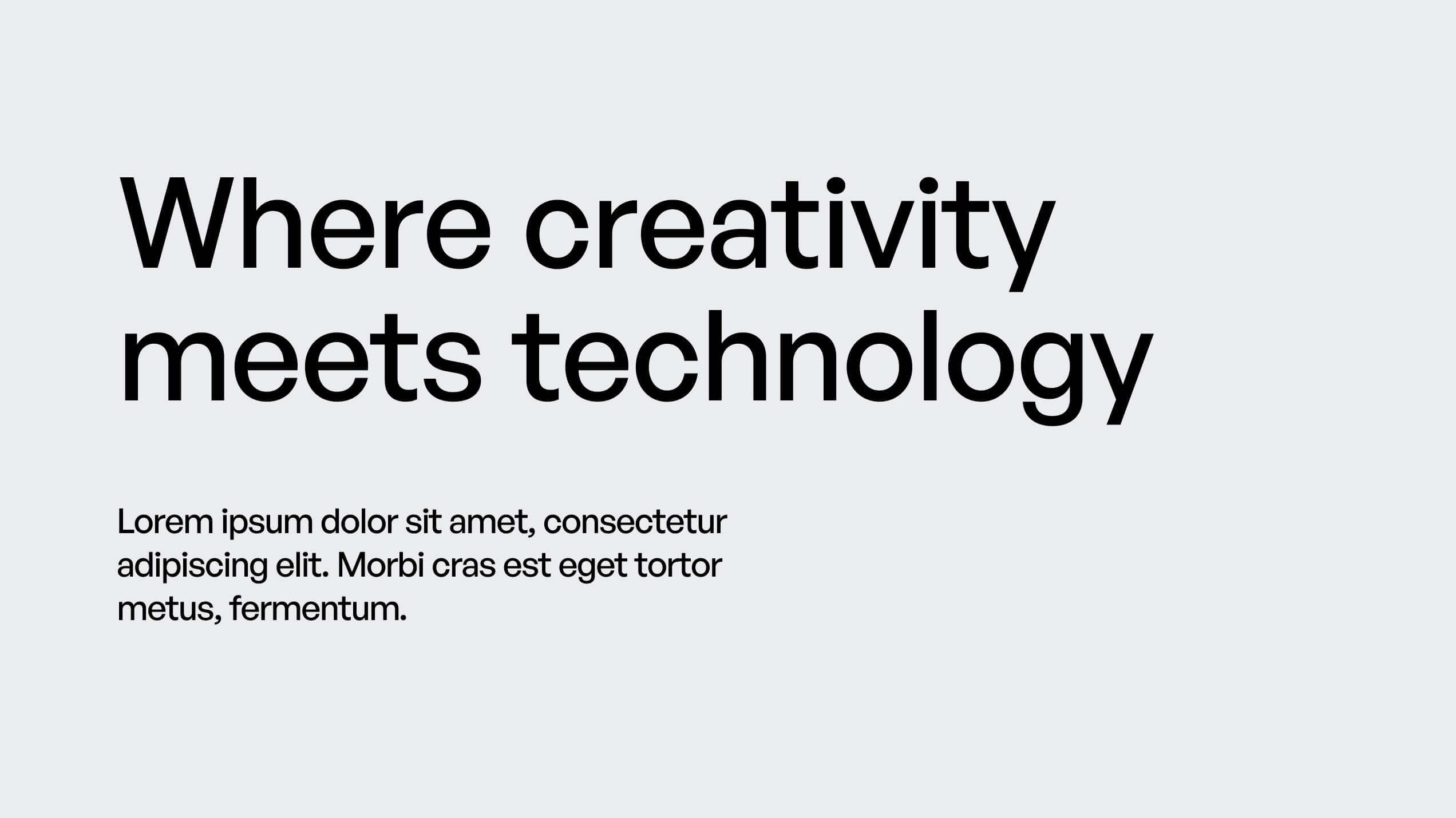
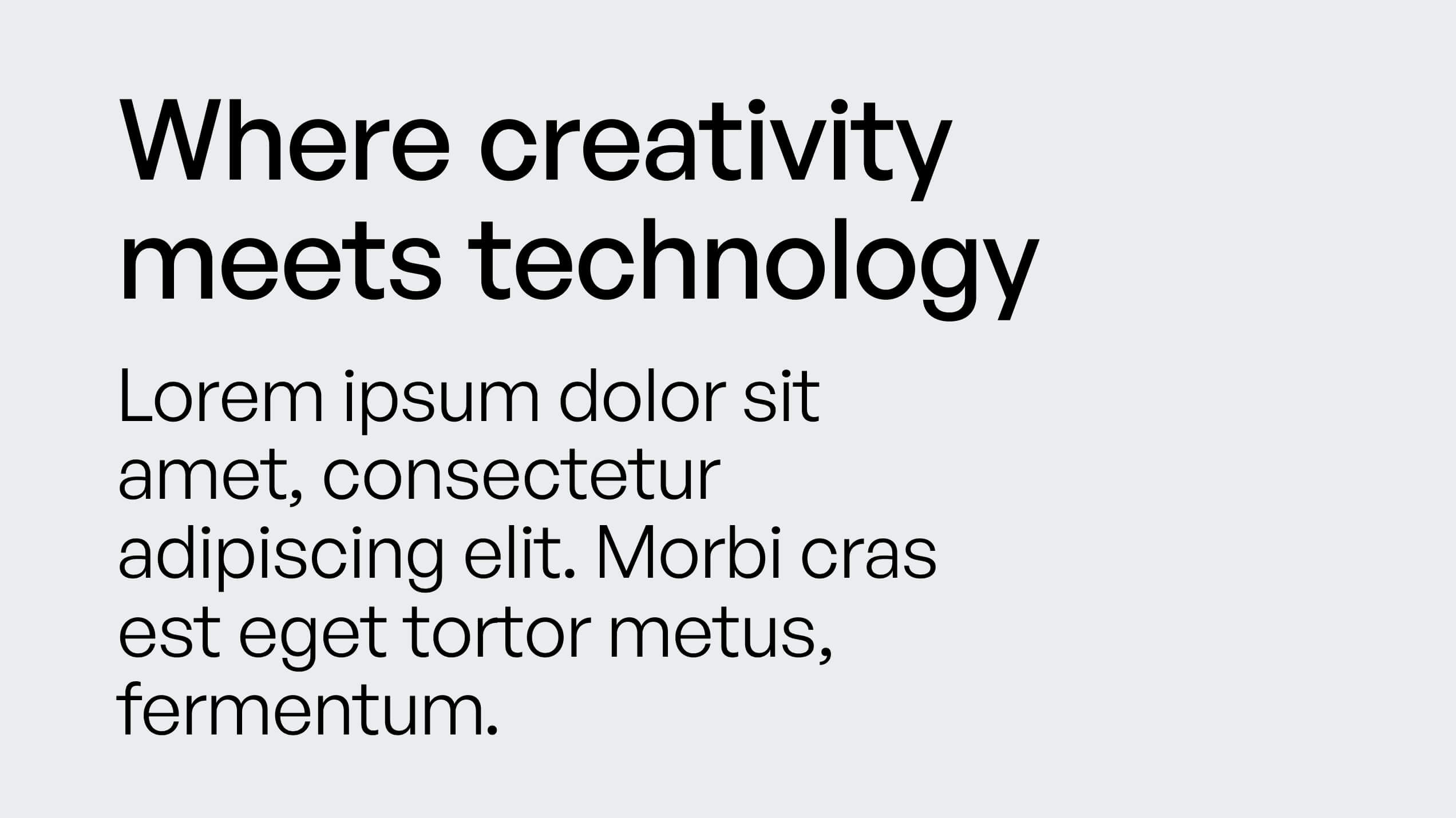
In some instances, it might be necessary to break this rule and have two type sizes that are closer together. In this case, a minimum 35% size difference should be followed.
Type On Image
Typography can also be applied on top of imagery. In these instances, use black typography on lighter images, and white typography on darker images to ensure that there is enough contrast. Never use color typography on imagery.
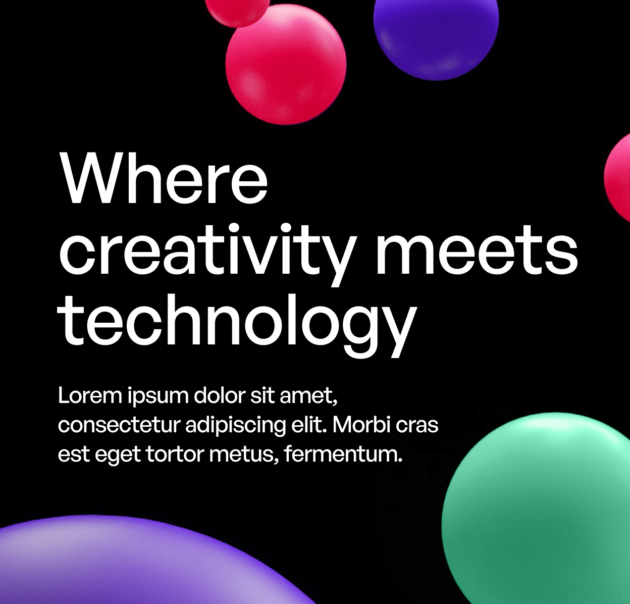
Do’s
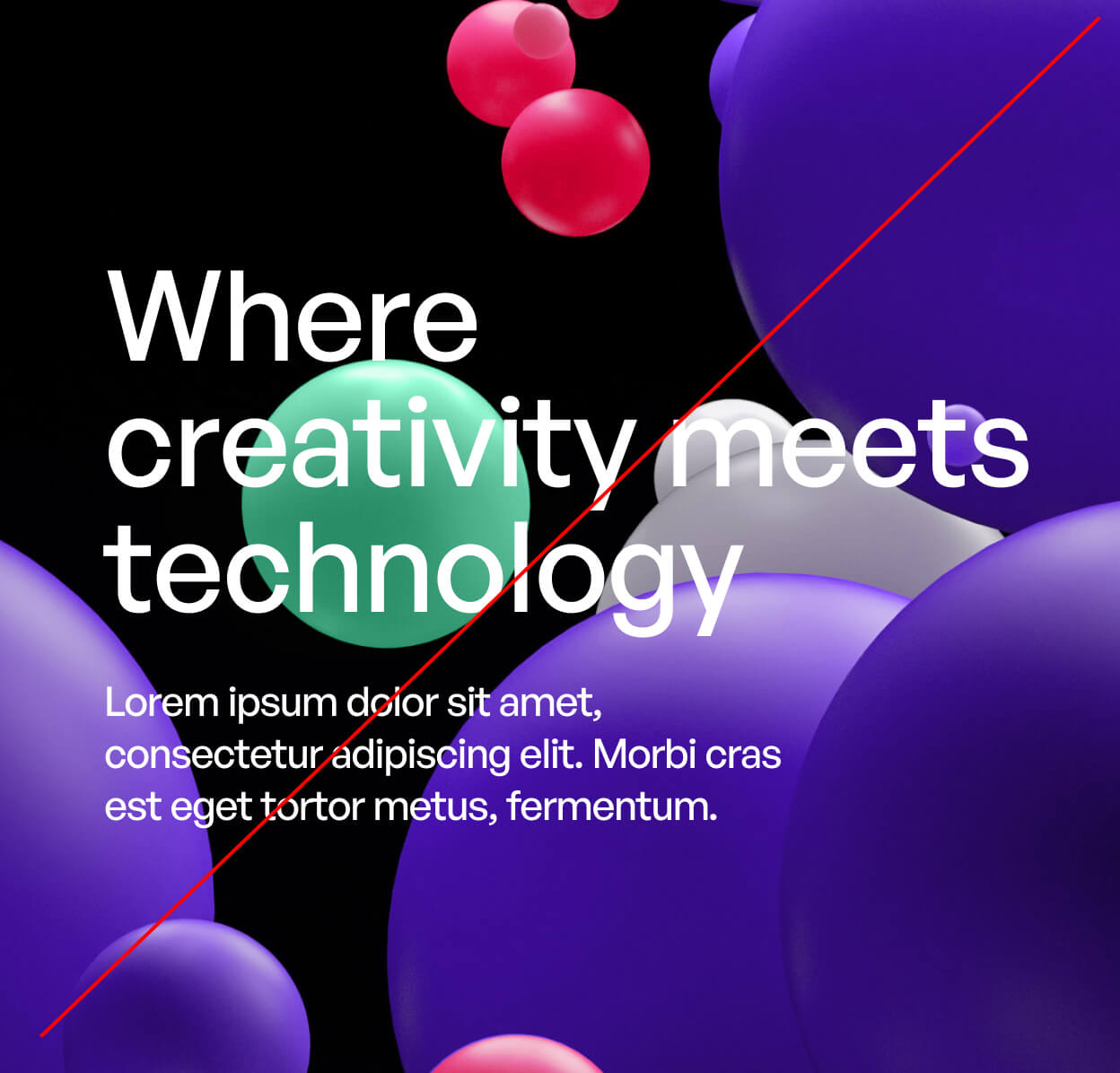
Dont's